
-
 chevron_right
iCloud web gets a slick and more functional beta redesign
news.movim.eu / ArsTechnica · Wednesday, 26 October, 2022 - 21:29 · 1 minute

Apple managed to stuff at least one more release into an already jam-packed October. A beta redesign of the web-based interface for iCloud makes it more customizable and visually appealing. It's worth bookmarking, especially if you occasionally use a mix of Apple-made devices and other computers.
The big difference is customization. The current iCloud web portal , when logged in, presents you with a grid of large buttons, which you can't move or change. It's a mild irritation if you don't use some of those services, or want to quickly create a new note, calendar appointment, or other item without having to head into the app. The beta, accessible at beta.icloud.com (or through a link on the current iCloud site), lets you choose which iCloud items deserve their own widgets, how they're arranged, and gives you a "+" button to quickly create new items, both in the widgets and in the upper-right corner.
-
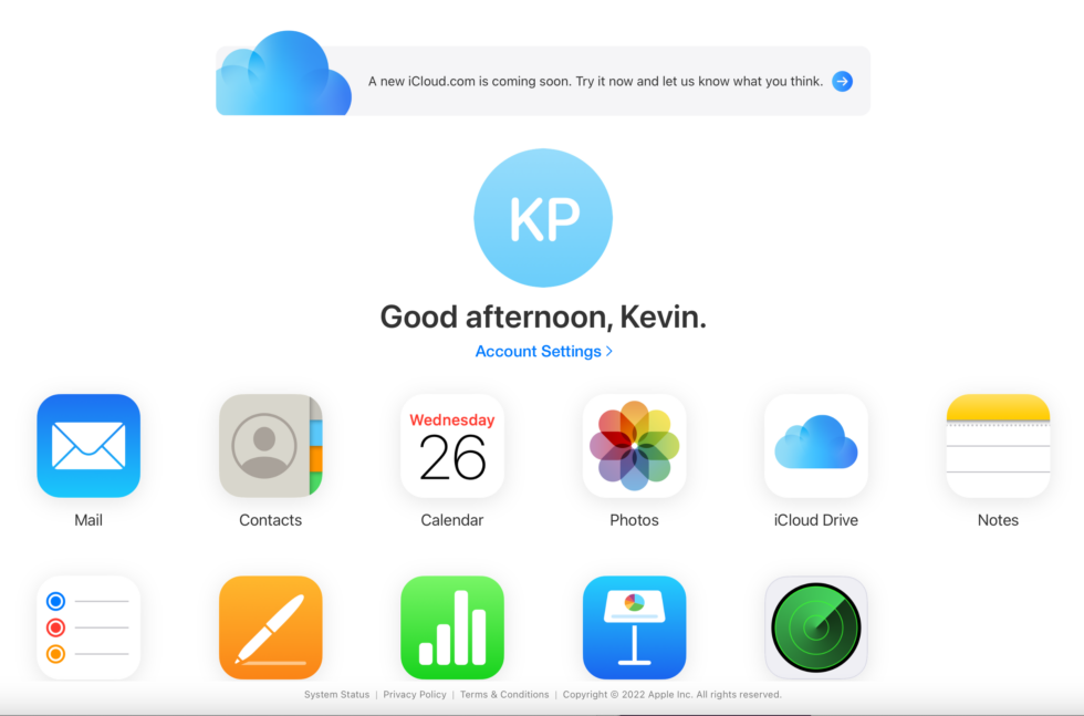
iCloud's web portal, as it exists for most people, today, with a nudge to check out the beta redesign.
Apple hasn't abandoned its rigidity entirely, of course. Widgets can be two-column width when viewed in a wider browser, but only one per row, in alternating left/right alignment down the page. Most people aren't going to use iCloud's web interface as a primary interface, but it can be convenient for accessing your data when you're on non-Apple machines, or not signed in. The apps have the same interfaces and capabilities as before.